
I Was Mistyped Twice—Why Does Accurate Color Analysis Matter?
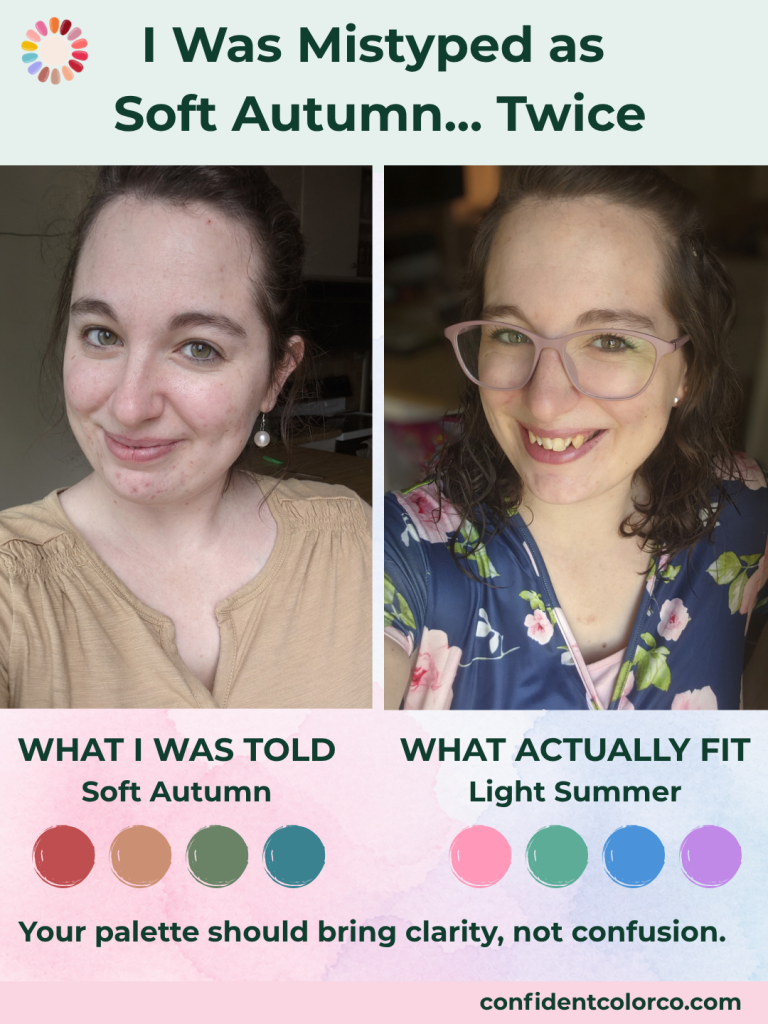
I was mistyped in color analysis: not once, but twice.
I was a new mom with a toddler and a newborn, and I felt desperately frumpy. When I looked in the mirror, I barely recognized myself in this new body, and my clothes didn’t feel like ME.
I learned about color analysis and purchased one from an online company who promised to tell me my season based on photos. I sent them in. I tried my supposed Soft Autumn colors and they didn’t feel right, so I tried again with a different company.
Again, I was told I was a Soft Autumn.
And honestly, when you receive the same answer twice, you assume it must be right. So I tried to make it fit. I looked at the Soft Autumn colors, tried to understand the palette, and figured I just needed to learn how to wear it better.
But something still didn’t feel quite right, and no matter how much I tried, I kept gravitating towards the same few colors inside the palette because they were the only ones that made me feel like me.
When Your Color Season Doesn’t Feel Like You
The whole point of color analysis is to bring clarity. It should help you understand why certain colors make you feel bright, healthy, and put together, while others seem to wear you instead.
But being given the wrong season only prolonged the confusion I was trying to solve.
Instead of feeling more confident, I was still questioning why the recommended colors didn’t seem to do what they were supposed to do. I had an answer, technically…but it wasn’t an answer that truly reflected me.
Eventually, I received another professional color analysis and discovered that I’m actually a Light Summer.
Suddenly, things began to make sense.
The lighter, cooler colors felt more natural and harmonious. Instead of trying to force myself into a palette that didn’t quite fit, I finally had an answer for why the colors I had gravitated to were the ones that felt most like me.
Color Analysis Shouldn’t Force You Into a Box
That experience taught me something important: color analysis isn’t just about placing someone into the closest available category.
And it definitely isn’t about deciding that someone “looks like” a certain season and stopping there.
It’s about carefully observing how color interacts with the person in front of you. What happens to her skin? Do shadows become more noticeable or begin to soften? Do her eyes become clearer? Does the color bring attention to her, or does it become the first thing you see?
There’s a difference between finding colors that are technically close and finding the colors that genuinely support someone’s unique coloring.
I know how frustrating it is to receive an answer, try to follow it, and still feel like something is off.
That’s one reason I care so much about approaching every analysis carefully. I don’t want to push someone toward a quick answer or make her fit a predetermined result. I want her to feel seen, understood, and confident that the guidance she receives actually belongs to her.
The Right Colors Should Feel Like Clarity
Finding out that I was a Light Summer didn’t change who I was.
It helped me see myself more clearly.
That’s what good color guidance should do. It shouldn’t tell you to become someone different, follow a trend, or replace everything you own. It should give you practical information you can use to make getting dressed simpler.
You may still love and wear colors outside your palette. I certainly don’t believe color analysis should become a list of rigid rules. But once you understand what naturally works with your coloring, you can make those choices intentionally instead of constantly wondering why something feels wrong.
If you’ve been analyzed before but your result never really felt like you, it’s okay to ask questions.
Your color palette should bring clarity, not create more confusion.
And if you’re looking for personalized guidance that helps you feel understood rather than pushed into a category, I would love to help you discover the colors that genuinely feel like you.
[Discover Your Best Colors with a Personalized Color Confidence Guide]
